|
This year I decided I wanted to create my own classroom rules or code of conduct to fit the type of classroom environment I want to create for my students. I tried having my class create rule or jobs last year, but it didn't really work all that well. There were things that my students did or didn't do that drove me crazy last year so I created these rules to help fix some of those behaviors. When looking for inspiration on Pinterest I found this "Classroom Rules- The 5 P's" idea and I really liked it. I adjusted it a little to fit my needs and I added the Big I because helping my students learn to take initiative is a huge goal of mine. So below is the poster size version of my classroom rules! Let me know what you think.
So now that I had created new rules from my classroom, I wanted to reformat and adjust my classroom syllabi. Most middle and high school syllabi are 2-4 pages (one sided) if there even is one. Mine last year was 5-6 pages long (one-sided). I think my students (and other teachers probably) thought I went a little overboard. Even so, to me a syllabus is a place where all of the classroom policies and information about a class are located. I wanted my students to know up front what my expectations and policies were so that there were no surprises later. I didn't want my students to be able to say...
"Oh I didn't know about that" or "That's not fair, you let him do ______."
I still believe this about my syllabus for this coming school year. It still contains all of the information I think they need to know to be prepared for my class. However, I've condensed my explanations and made it more visually interesting. I also took out some policies that I didn't use or had changed my mind about during my first year of teaching.
I got this idea about making my syllabus more visually interesting from Jackie at Room 213. She had a post about making a digital syllabus and it included a FREE template. So I used her fantastic template and made it my own by changing colors, fonts, and adding my own information. I am so grateful to her for sharing such a wonderful free resource!
So without further ado, here is my Health 9 Syllabus for this year.
If you would like to learn how to embed PDFs from Google Drive like I have done above, click the "Read More" below!

2 Comments
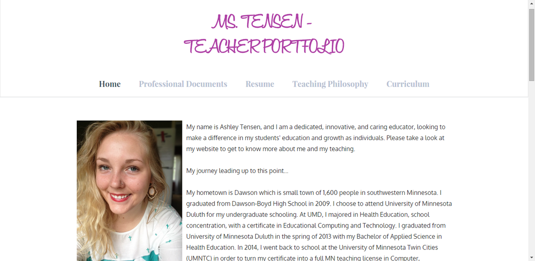
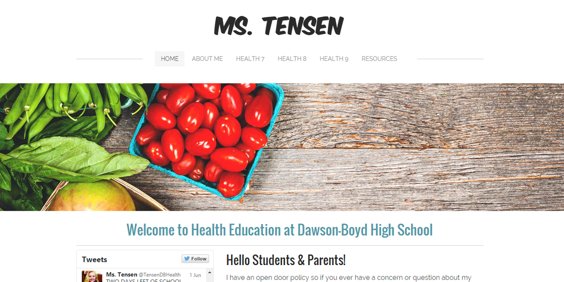
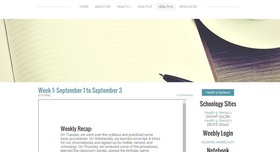
So now that it's summer I have a little (more like a lot) more time to work on things. Recently I updated the aesthetics of both my class website and online teaching portfolio as well as updated some of the content on my portfolio. I am very pleased as to how they turned out. If I haven't said it before, I'm going to say it (again) now, I LOVE Weebly! They all look so clean and professional! I have the links to both sites above, but I will post some screenshots of how they look now as well. First us is my Teacher Portfolio. I wanted to simply this site and update my content. I chose three fonts and one color, purple, my favorite color of course and for the theme I went with Journey. I love that the tabs move as you scroll down the page. I think the new aesthetics showcase my qualifications so much better now! Next is the class website. I wanted to make my site less busy and less girly. Although I love making things girly, I try not to go too crazy because I know it can be a turn off to the young men in my classes. I think I accomplished both with this final round of editing. I went with only two colors, black and blue, and three fonts. The main heading is Komika Axis, titles are Oswald, and everything else is Raleway. I thought the fonts I had before were a bit much (and kinda girly) so I'm very pleased with my new choices. As for the theme I had before, I think the background got to be too much with the pattern and colors. I like having the white background, I think it puts the focus is on what students are there for, the content and links! I also changed my email signature. I added the URLs to my web portfolio and blog and decided to delete the quote I had on the last one. I love the quote I had on the old one but I like the simplicity of this one better with just one image.  If you are wondering what the old versions looked like take a look back to my post from last December. Unfortunately, I didn't post pictures of what my portfolio previously looked like but I can tell you the current version is better! Overall what I went for with all of these changes and updates was to de-clutter and simply. The way everything was wasn't terrible, but to me they felt overwhelming to look at with too many colors, patterns, fonts, etc. Less is definitely more! 
I haven't posted on here in a while again as somehow this semester is crazier than the last, but I'm surviving. So I've learned about this instant response tool at MELT day back in January. The presenter only briefly mentioned it but I was intrigued so I looked into it and I love it! Below I have embedded the smore I created for one of my online classes in order to share "my favorite tool" with my classmates. Check it out!

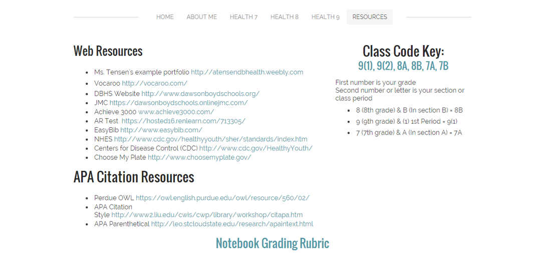
I am pretty proud of my class website so I thought I'd share that with everyone here! I used Weebly to make this site (I love weebly). I choose Weebly because there were no ads, it looks professional, it is not cluttered, and it has an easy to use interface for designing/creating. Each class has its own tab where I embed a weekly document with what we did in class, papers given out, and assignments turned in or assigned during that week. Also along the side of each classes blog I keep class specific links such as for class recordings, turn in dates for notebooks, etc. I have a resources page that I have links to all kinds of things that students need access to frequently such as AR Test, online grade book, school website, Achieve 3000, etc. Below I have included screen shots of my website as well as link to my site if you'd like to check it out for yourself! 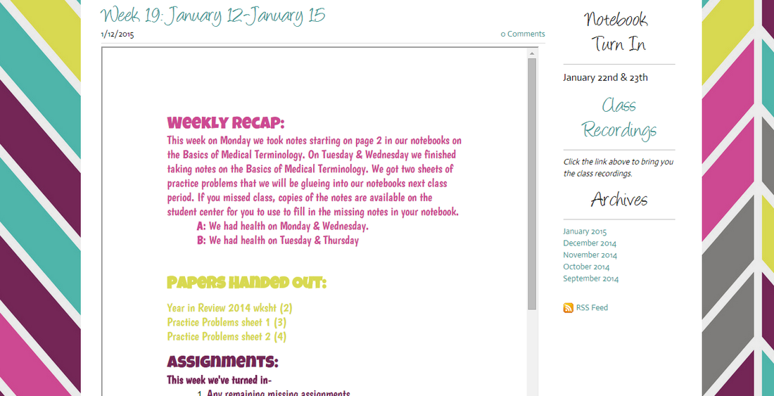 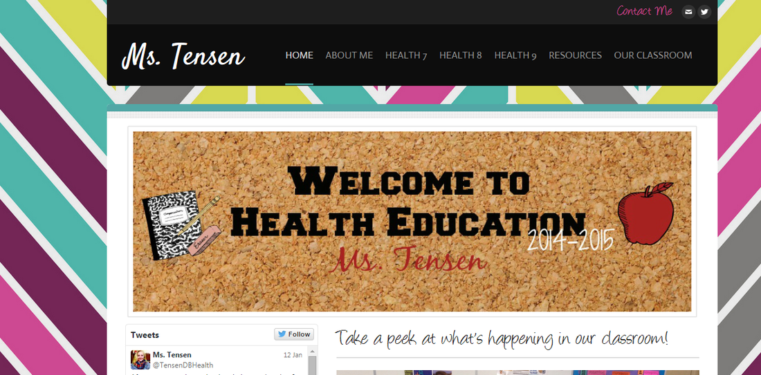  |
Author

I teach 7-9 Health Education & Computer 7 in rural southwestern Minnesota. I love using technology in my classroom and teaching students about how to live healthy and informed lives.
Archives
April 2016
Categories
All
|
 RSS Feed
