|
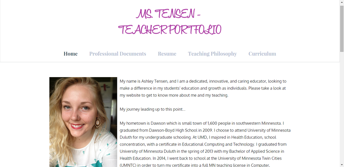
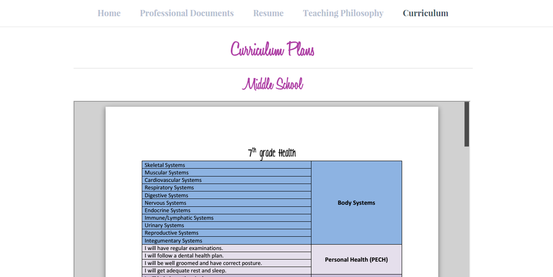
So now that it's summer I have a little (more like a lot) more time to work on things. Recently I updated the aesthetics of both my class website and online teaching portfolio as well as updated some of the content on my portfolio. I am very pleased as to how they turned out. If I haven't said it before, I'm going to say it (again) now, I LOVE Weebly! They all look so clean and professional! I have the links to both sites above, but I will post some screenshots of how they look now as well. First us is my Teacher Portfolio. I wanted to simply this site and update my content. I chose three fonts and one color, purple, my favorite color of course and for the theme I went with Journey. I love that the tabs move as you scroll down the page. I think the new aesthetics showcase my qualifications so much better now! Next is the class website. I wanted to make my site less busy and less girly. Although I love making things girly, I try not to go too crazy because I know it can be a turn off to the young men in my classes. I think I accomplished both with this final round of editing. I went with only two colors, black and blue, and three fonts. The main heading is Komika Axis, titles are Oswald, and everything else is Raleway. I thought the fonts I had before were a bit much (and kinda girly) so I'm very pleased with my new choices. As for the theme I had before, I think the background got to be too much with the pattern and colors. I like having the white background, I think it puts the focus is on what students are there for, the content and links! I also changed my email signature. I added the URLs to my web portfolio and blog and decided to delete the quote I had on the last one. I love the quote I had on the old one but I like the simplicity of this one better with just one image.  If you are wondering what the old versions looked like take a look back to my post from last December. Unfortunately, I didn't post pictures of what my portfolio previously looked like but I can tell you the current version is better! Overall what I went for with all of these changes and updates was to de-clutter and simply. The way everything was wasn't terrible, but to me they felt overwhelming to look at with too many colors, patterns, fonts, etc. Less is definitely more! 
0 Comments
|
Author

I teach 7-9 Health Education & Computer 7 in rural southwestern Minnesota. I love using technology in my classroom and teaching students about how to live healthy and informed lives.
Archives
April 2016
Categories
All
|
 RSS Feed
